The way we present our work (like our products, services, or support) to our clients matters.
The way we perceive something changes how we experience it. How we value it. How we remember and use it.
If we want our products, services, or support to be valued, we need to make them look valuable.
That’s something I’m working more on this year. I want to get better at making sure the work I do for my clients looks, sounds, and feels every bit as good as it works.
I hope you’ll join me on this journey, and I hope that how I’m approaching this might inspire you to find ways to make the way you present what you sell every bit as impressive and appealing as the thing you sell itself.
Why I’m Working On This
Great work that’s hard to understand doesn’t actually help. As David Ogilvy’s brother once put it, we need to avoid “the slippery surface of irrelevant brilliance.”
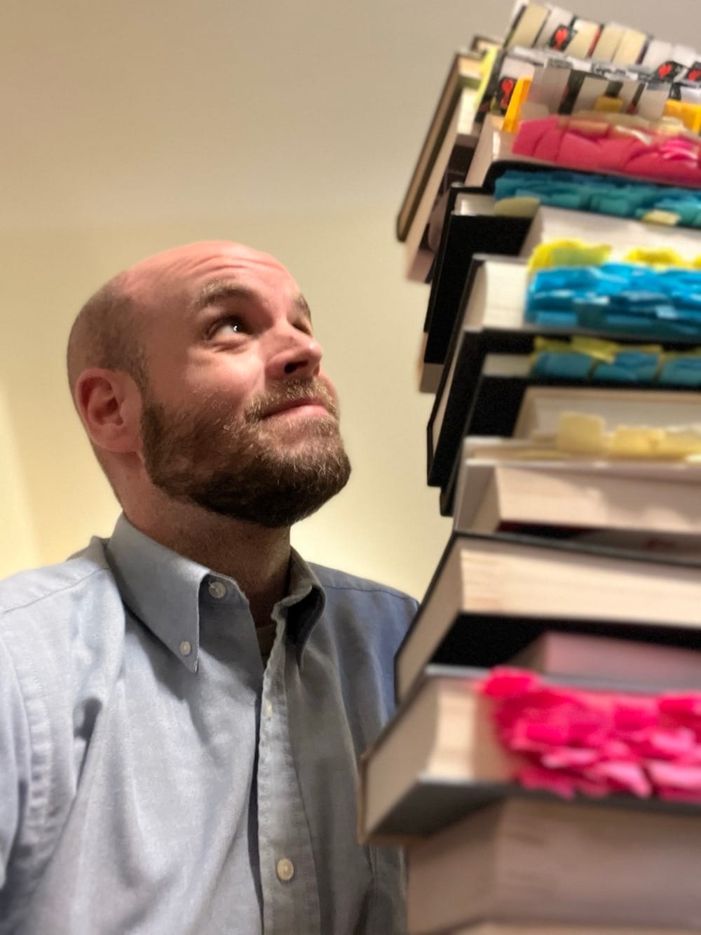
Look, I’m a words guy. I read a lot and learn best that way. I think in words and my internal chatter is a constant stream of sentences.
Which makes it easy to forget that that’s not how everyone is. That’s not how everyone learns. First of all, not everyone has the time to read as much as I do. And not everyone has an internal monologue, let alone one as persistent and prolific as mine.

This is an issue because the way I’ve tended to present my work, the way I’ve preferred to present it, is extremely textual (like this newsletter). When I explain the rationale behind a certain positioning statement I’m proposing, or a value proposition, or a specific marketing message, the language I use can tend to be very prescriptive, precise, and prosaic. And, well, prosaic is a synonym for dull for a reason.
But, honestly, I’ve been a bit stubborn about it.
I’ve gotten the feedback before that the way I present my work can be hard to parse for people who aren’t words-first thinkers. The more visual, the more abstract, the more example-driven can sometimes find my work unnecessarily difficult to understand and internalize.
So today’s newsletter is a dive into how I’m thinking about the challenge and how I intend to address it. And how you might, too, if you’re facing a similar challenge.
(But don’t worry, this newsletter is still a text-first medium)
First, we’ll talk about how our work looks. Then, how it sounds. And, finally, how it feels.
Follow along and note any opportunities you might have to improve how your work is presented so your customers and clients understand its value at a distance.
How It Looks
My work is not just read, it’s seen. And there’s a distinction there.
Da Vinci once wrote that if you think you can describe human anatomy in words alone, you must “banish the idea from you. For the more minute your description, the more you will confuse the mind of the reader, and the more you will lead him away from the knowledge of the thing described.”
That’s why he developed the first 3D sketches of the human body, which immediately made biology more obvious, more clear, and more useful.

Whether I like it or not, the same is true for my own work. I can sometimes imagine that the more minute and precise my textual descriptions, the clearer something becomes. But the opposite may occasionally be true instead.
That means it’s going to become necessary to translate my ideas, concepts, frameworks, and recommendations into diagrams, videos, sketches, and more.
As Rory Sutherland wrote, “The job of a designer is hence that of a translator. To play with the source material of objective reality in order to create the right perceptual and emotional outcome.”
If I want my work to be internalized and acted upon, it must first be understood. And it should be understood quickly, easily, and accurately. That means translation, adapting the verbal concepts in my mind into images or abstractions in the mind of my clients.
But there’s something more to visuals than simple explanation: Adding visuals adds variety.
As Scott L. Montgomery put it in The Chicago Guide to Communicating Science, “visual discourse adds variety for the eye and enhanced appeal for the mind.“
It’s not as trivial as it might sounds. As he writes, “The psychology of reading is not a little complex. The living brain very much appreciates intelligence expressed in different forms.“
The living brains of my clients appreciate intelligence expressed with variety and novelty, and that’s the first thing to remember and the first component to address.
Now, what about you?
What do you make and sell, and when you present it to your customers and clients, how does it look? Does the presentation, the offering, the packaging, the description, demonstrate the value of what’s inside?
Are you using too many words and not enough diagrams? Too many explanations, and not enough examples? Too many bullet points and not enough illustration?
Take a moment and write down anything you can think of that could be improved to make sure that the way your clients see your work is every bit as impressive and appealing as the work itself.
How It Sounds
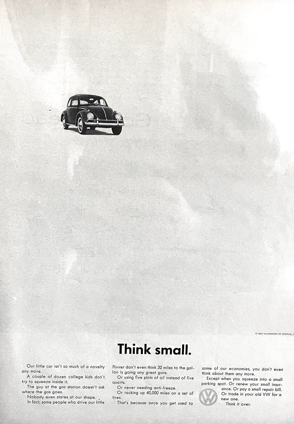
My favorite print ad of all time (“Think small.”) is so great because of its clear, pithy, and funny writing. But it didn’t start that way.

In fact, the art director for the first version of the ad, Helmut Krone, actually cut out blocks from the paper to illustrate to the copywriter how the copy should be written.
The writer at first resisted, insisting that “some of the sentences will only be one word long, and that’s not grammatical.”
But Krone said, “It doesn’t matter. It looks good, it looks accessible, it looks readable.”
The words for one of the best-written ads of all time were designed first. How the ad sounds dramatically changes how it’s understood (and, frankly, whether it’s read at all).
And how my work sounds affects its utility. One of the things I’ve always focused on is pithiness and precision. I like short, declarative sentences. I like to make my point and move on.
But, as Ogilvy, quoting E. B. White, warned: “When you say something, make sure you have said it. The chances of your having said it are only fair.”
Just because I like and benefit from brevity, that doesn’t mean all of my clients do. And that doesn’t mean it’s always the best way to learn. So one of the things I want to get better at is artful, clarifying repetition.
Saying the same thing again, but in a novel and revealing way.
“The spoken word is the music of knowledge,” Montgomery wrote, which means it’s vital to use words artfully, creatively, and, occasionally, copiously.
Because my clients deserve the time and energy it takes me to make my recommendations sound as good as they work.
What about you?
When your customers or clients take hold of the work you’ve done or the product you’ve created, how does the packaging, the presentation, the appearance of it sound? Is it easy to grasp, clear to understand, and enjoyable to hear?
Or is it full of run-on sentences, busy blocks of text, or impenetrable instructions?
Are you relying on your clients understanding everything on the very first go, or are you providing artful, clarifying repetition?
Take a second to write down a few ways the way you present and package your work sounds when it’s read or heard. Where could things flow more musically? Where could you use repetition or rhyme to improve the sound of your work?
How It Feels
In some sense, my work should feel familiar to my clients. That is, they shouldn’t have to learn a fundamentally new way of, well, learning, just to get what I’m saying.
First-time clients come with certain expectations about how ideas, strategies, concepts, and copywriting are presented, and that’s not necessarily a bad thing. There’s a marketing strategy-shaped hole in their mind that it’s my job to, yes, adjust, adapt, and improve. But first, I’ve got to fit it.
Once I’ve proven my abilities and the work has proven itself right, customization and more creativity can occur. But first, it should feel easy to understand and accept.
One of my favorite stories that Rory Sutherland talks about in Alchemy is that the first Sony Walkman didn’t have a record button. Not because it couldn’t, but because the Sony CEO knew it shouldn’t. If you give a brand new thing too many buttons, people won’t be sure what to use it for.
But when you make the format of a thing clear about the function, people always know what to do. And so they’re more likely to do it.
My work, in the same way, needs to make itself clear. It shouldn’t have too many extras, additions, or unnecessary addenda. What you’re supposed to do with what I’ve given you should be so clear there’s no way to mistake it, misuse it, or misunderstand it.
Like the advertiser and writer Dave Trott says, “Present your ideas on toothpicks.”
Have you ever been presented with a meal or appetizer and stared at it wondering how you’re supposed to approach it without making a mess or embarrassing yourself? Sure you have.
And it’s possible that, sometimes, my clients (and maybe yours) have had a similar thought when presented with products, services, or recommendations.

But when you present food on a toothpick, there’s no mistaking what you’re supposed to do with it. So I want to think more about how I can present my work on proverbial toothpicks, so it’s abundantly clear what you’re supposed to do with it.
That means more documentation that is itself functional. Diagrams that can be filled in and used by the clients. Illustrations that can be saved or even printed off. Functional worksheets that present the work and implement the work at the same time.
Because for the work to work it’s got to be worked. And I need to make that extremely easy and obvious to do.
What about you?
How does your work, your product, your service, feel? Is it familiar and friendly? Or is it serious and scary?
Does the way you present your product or service make it abundantly, unmistakably obvious what the customer is supposed to do next?
Does your work include the means of implementing it, or does it require extra work, extra knowledge, or extra support? And is there a way to include those elements in the presentation, in the packaging, so it’s easy and obvious (like putting it on a “toothpick”)?
This is a long-term project, something I’ll be picking away at over the course of the year. I don’t believe in resolutions, but I do believe in giving yourself the time and space to improve without pressure.
So, I hope you’ll join me on this journey, and I hope you’ll find ways to improve your own presentation, packaging, and performance so your best customers and clients understand and grasp your value at a distance.
And so the way your work looks, sounds, and feels is every bit as impressive and appealing as the work itself.
If you have any questions, thoughts, or recommendations about what to work on next, just reply to this email or reach out at labs@kelfordinc.com.
Kelford Inc. shows entrepreneurs the way to always knowing what to say.
If you’re looking to improve the way you reach and attract customers and clients this year—by always knowing exactly what to say—please visit KelfordInc.com

